With a diffusion model you plan the prompt. With hand-drawn SVG there is no prompt – the planning moves earlier, into the metaphor itself.
Table of Contents
Why SVG needs a metaphor, not a prompt
Prompting a diffusion model is a craft of words: you describe a scene and forbid its failure modes, as the companion guide on AI image generation best practices explains. Drawing the same concept as SVG has no such prompt. Because you place every shape yourself, the thinking happens before any code: you decide what to draw. That decision — the metaphor — is where all the planning lives, and it is a different skill from writing a prompt. The mechanics of building the file are covered separately in the guide on SVG hero images with Claude Code; this article is only about inventing the picture.
With hand-drawn vector, the hard part is not the code – it is deciding what the concept looks like.
Step 1 – Reduce the subject to one mechanism
Ask what the subject does, in one sentence, then draw that. Not its name, not its field — its behavior.
- A database transaction either fully completes or fully undoes — all-or-nothing.
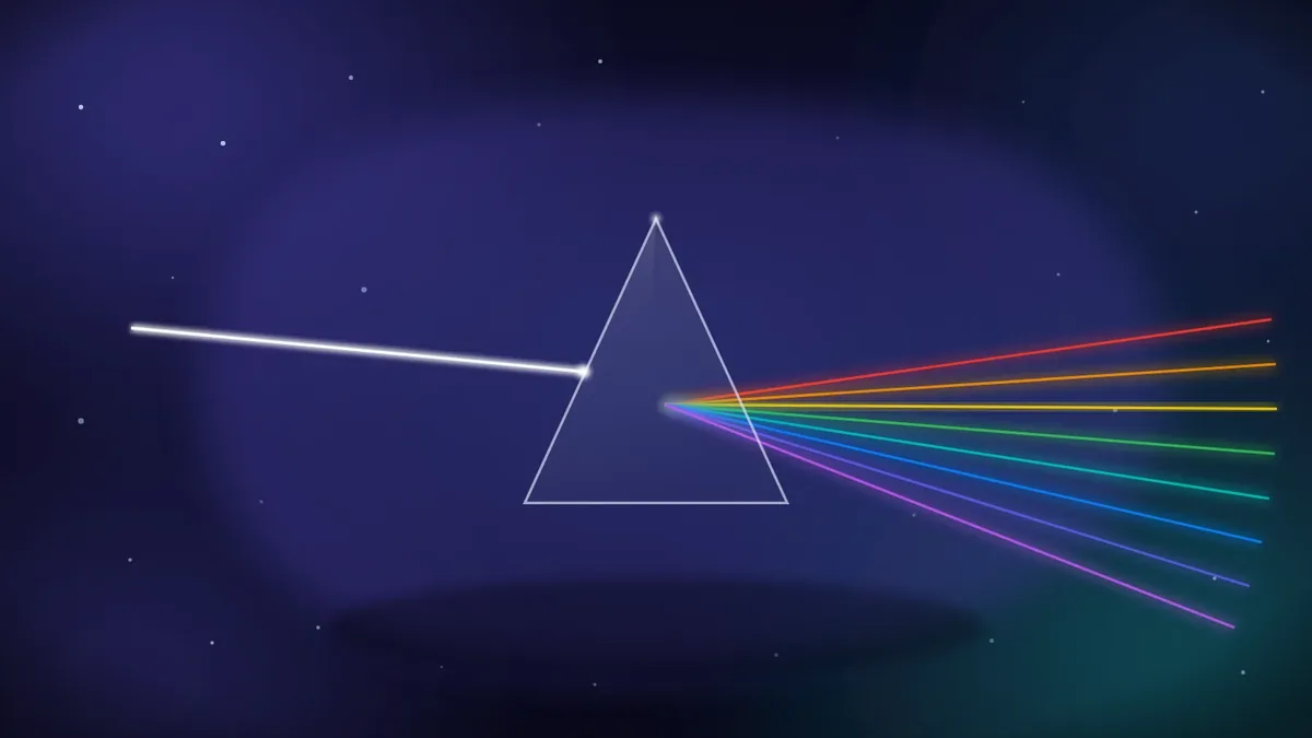
- A prism splits one beam of white light into its separate colors.
- Machine learning takes many inputs and combines them into one trained result.
The sentence is the brief. Everything on the canvas should serve it and nothing should distract from it.
Step 2 – Find forms that enact the mechanism
Now translate the sentence into objects that perform it, not a symbol that merely labels it. For light and optics, a single white beam entering a prism and fanning out as a spectrum enacts “one beam becomes many colors” — you can read the process, not just a lightbulb icon:
For machine learning, input nodes feeding through weighted edges into one bright central core enacts “many inputs become one result”:

In both, the forms do the thing. That is the difference between a metaphor and a clip-art icon.
Step 3 – Encode the key moment as one focal accent
Most concepts have a single crux — the moment that matters. Give it one warm accent so the eye lands there first. In a transaction hero, the crux is the rollback: records advance toward a gate, one falters, and a bright arc sweeps the whole set back to the start. The accent is the idea:

In an entrepreneurship hero, the crux is the launch. A small rocket climbs out of a dotted runway, and the only warm color in the frame is its exhaust — one accent carries “this is taking off”:

Give the concept’s key moment one bright accent, and the reader’s eye finds the point before they finish looking.
Step 4 – Compose around one idea, centered
A hero is glanced at, not studied, so it must carry one idea and carry it in the middle. Put the focal mass on the center axis and balance the supporting shapes around it; resist adding a second metaphor. If the bright element drifts toward a corner, the image reads as lopsided and the idea weakens. One centered idea beats three competing ones every time.
Step 5 – Color the metaphor from its context
The metaphor decides what is drawn; context decides what color it is. Security reads cool; heat reads warm; data reads violet. Choosing the palette from the subject keeps a large set coherent without making every image the same hue — the same treatment, a different key per topic.
Because the color lives in a few tokens, one finished metaphor is not locked to a single look. Change those codes and the same drawing wears a new palette, so one file can be reused in many places — a different color per section, per theme, or per campaign — from a single source.
Handling the hard cases
Some titles resist a literal metaphor. Three rules keep you unstuck:
- Opaque titles (an internal code, a vague label): fall back to the subject’s domain and draw that, never an invented specific.
- Other languages: draw the subject or its culture, not the language. A course titled in Spanish about the microbiome is still a microbiome picture.
- Sensitive subjects: stay abstract and hopeful; a hard topic is served by restraint, not literal depiction.
Anti-patterns to avoid
Three defaults signal that the metaphor step was skipped:
- The generic dot-network used for every technical subject regardless of topic.
- The laptop or graduation cap standing in for any course — a label, not a metaphor.
- The literal diagram with legible axes or a schema, which reintroduces the text and data problems SVG exists to avoid. Suggest structure; never spell it out.
The short version
SVG metaphor design is prompt planning moved one step earlier. Reduce the subject to a single mechanism, draw forms that enact it rather than a symbol that labels it, encode the key moment as one warm accent, compose around one centered idea, and color from context. Handle opaque or non-English titles by depicting the subject, avoid the stock defaults, and an abstract concept becomes a hero a reader understands instantly.
Frequently Asked Questions
What is a visual metaphor in the context of SVG heroes?
It is a concrete arrangement of shapes that performs a concept rather than labeling it — a white beam fanning into a spectrum for optics, records rolling back for a transaction. Because you draw it by hand, choosing the metaphor is the real planning step.
How is planning an SVG metaphor different from writing an image prompt?
An image prompt describes a scene in words for a model to interpret. An SVG metaphor is a decision about what to draw before any code exists. There is no wording to tune; the quality comes from the idea, then from clean execution.
How do I turn an abstract topic into a picture?
Write one sentence describing what the subject does, then draw forms that enact that sentence. Encode the crux as a single bright accent and keep everything else in support. If you cannot draw the sentence, you have not reduced the subject far enough yet.
What should I do when a course title is opaque or in another language?
Depict the underlying subject or its culture, not the words. For an opaque internal label, fall back to the broader domain and draw that. Never invent a specific detail the title does not support.
Why avoid a generic network-of-dots image?
Because it labels “technology” without saying anything about the specific subject, so every topic looks the same. A metaphor that enacts this subject’s mechanism carries meaning a stock graphic cannot.

