Our code-drawn hero kit and Gemini, writing SVG for the same subjects, went head to head. Gemini won the hard-science rounds. So we read why it won, rewrote the kit, and ran those rounds again.
A note on the setup, because it matters: both sides were vector code. Gemini’s images here are SVG it wrote itself, not pixels from an image model; asking it for markup is a coding task, so it didn’t hit the image model’s quota either. That makes the comparison cleaner than “code vs AI art”: same medium, two authors, so every difference is a difference in technique. (When we do want raster images, that’s a separate engine; the case for running both is in Vector vs Diffusion: Why Scaling AI Images Needs Two Engines, and the kit’s method in How to Generate SVG Hero Images with Claude Code.)
Table of Contents
The bake-off and the scorecard
A large catalog needs a hero on every page, so the kit draws conceptual and science subjects as clean, glowing, layered scenes with no quota and no risk of garbled text. The question was whether it was good enough on that half, or merely cheaper. We picked six subjects, gave Gemini a matched brief for each, and judged the pairs side by side:
| Subject | Verdict (2026-09-25) |
|---|---|
| Cybersecurity | about a tie |
| Cloud & DevOps | about a tie |
| Data analytics | slight edge to Gemini |
| Entrepreneurship | Gemini ahead (we later answered it with a new “rocket” metaphor) |
| Organic chemistry | Gemini clearly ahead |
| Thermodynamics | Gemini ahead |
The two science rounds were the uncomfortable ones. Gemini’s molecule was a believable three-dimensional structure; ours was a flat hexagon. Its thermodynamics image showed energy moving; ours was a lattice that didn’t read. Our science metaphors were emblems, not scenes.
The easy response would have been to route those subjects elsewhere. But the kit’s properties (zero cost, exact repeatability, structural safety) matter most on exactly the subjects that recur thousands of times. So we asked a better question: what, specifically, is the other author doing that our code isn’t?
Study the winner, encode the technique
A better-looking competitor output is a gift, because it is concrete. You are no longer guessing at “make it richer”; you can name the moves.
A competitor’s better output is a free, concrete brief for what yours is missing.
Reading the winning science images closely, three techniques stood out:
- Depth through banding and shading. The strong molecule had atoms of varied size and shading arranged in perspective, joined by bonds that read as three-dimensional.
- A process, not a symbol. The strong thermodynamics image had a direction: an ordered, cool region resolving into a hot, energetic one. Something was happening.
- No staring core. A single luminous blob in the middle of a frame reads as an eye, a trap both sides hit that day. The fix is asymmetry and direction (the anti-eye rule).
We encoded each into the kit as deterministic building blocks, code rather than one-off drawings, so every future image gets them for free:
- The molecule was rebuilt as a tilted, perspective ring of element-colored, gradient-shaded atoms with real bonds and branching groups.
- The energy scene was rewritten to render a left-to-right process: an ordered cool lattice feeding streamlines of particles into a hot core, order becoming heat. It took two passes: the first rewrite produced a radiant core inside rings, which was better but static, and was itself drifting toward the eye trap.
- An anti-symmetry rule went into the kit so luminous cores stay off-center and directional.
Every rebuilt scene was render-verified, rasterized headless and checked for a healthy image, because vector art has a nasty failure mode where a broken reference renders pure black while passing every text-based validity check.
Copy the image and you fix one page; encode the technique and you fix every page, for free.
The re-run: before, after, and the image we were chasing
We re-ran the two lost rounds with the same briefs:
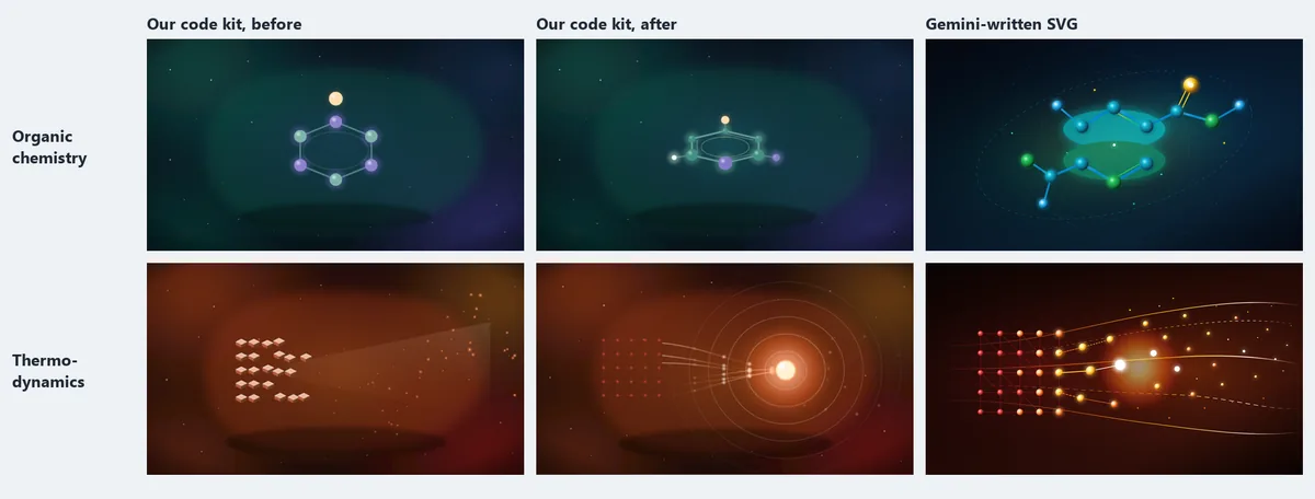
- Chemistry: from a flat hexagon to a molecule that reads as one. Against Gemini’s version, a near-tie.
- Thermodynamics: the rewritten scene tells the same order-to-heat story. Gemini’s still has more movement in it (its particles travel along curved paths while ours converge on a core), so we’d call it close, not equal.
With the technique in hand, three more science scenes (a cell/DNA structure, a wireframe geometry scene and light through a prism) came cheaply, and the kit went from 19 to 20 metaphors that day.
What happened next
The loop didn’t stop at two subjects. The next day we ran a wider calibration: 14 subjects drawn by our kit and by several Gemini models writing SVG, judged the same way. It became a routine. Whenever the other author draws something better, we name the technique and encode it. The kit has since grown to 55 metaphors. Gemini still wins some of the most elaborate compositions, and that’s fine: some variety across a catalog is a feature, not a flaw.
The short version
- A competitor’s output is the cheapest spec you will ever get. We didn’t brainstorm “how to make chemistry richer”; we read three named techniques off images that already worked, and implemented those.
- Encode the lesson, don’t copy the image. Copying one image would have fixed one page. Encoding banding, process and anti-symmetry into the kit fixed every science page.
- Scout, then workhorse. Use the more inventive author to explore what “good” looks like; use the cheap, deterministic kit to ship it at volume.
- Score honestly. Two ties, two narrow losses and two clear losses was the real starting point, and “close, not equal” is the real result on thermodynamics. Rounding it up would have hidden the next thing to fix.
Frequently Asked Questions
Was the other side a diffusion model?
No, and an earlier version of this article said so by mistake. Both sides were SVG: our kit draws with Python code, and Gemini (in Antigravity) wrote its own SVG markup for each brief. That keeps the comparison about technique rather than medium.
Why not just use Gemini for the subjects it won?
Because the kit’s properties (zero cost, exact repeatability, no surprises) matter most on subjects that recur thousands of times. It was cheaper in the long run to read why Gemini’s images looked better and encode those techniques once, so every future science hero inherits them.
What did “study the loss” actually produce?
Three named techniques: depth through banding and shading, a process rather than a static symbol, and motifs that avoid the centered “eye”. Each became a deterministic building block in the kit, not a one-off drawing.
Did the kit catch up completely?
Not completely. Chemistry became a near-tie; thermodynamics got close, with Gemini’s version still more dynamic. On the most elaborate scenes Gemini often still wins, which is why it stays in the loop as the scout.
How do you know a rewritten vector scene isn’t silently broken?
Every scene is rasterized headless and checked for a healthy image, because a broken reference in SVG can render pure black while passing every text-based validity check. Structural validity is not the same as a good picture, so you look at the pixels.

