Responsive images shrink one photo to fit every screen. Art direction does something better — it serves a completely different crop to a phone than to a desktop, so your mobile hero fills the screen instead of becoming a thin, unreadable strip. It’s a design win and a performance win at once.
srcset) do resolution switching: same crop, smaller file. Art direction uses the HTML5 <picture> element with media conditions to hand the browser a purpose-built image per breakpoint — a wide landscape on desktop, a tight vertical crop on mobile. The payoff is smaller mobile payloads, a faster Largest Contentful Paint, and a hero that reads clearly on a phone instead of wasting space on background nobody can see.WordPress has shipped responsive images since 4.4: upload once, and it generates several sizes and writes an <img> tag with a srcset. That solves resolution, not composition. A 16:9 desktop banner stays 16:9 on a portrait phone — a postage-stamp strip with the subject shrunk to nothing and background pixels the small screen never needed. Art direction fixes the composition, and trims the bytes while it’s at it.
WordPress default: one 16:9 file, resized per device. On a phone the wide crop becomes a thin strip – subject tiny, background dead space still downloaded. Composition lost.
media-gated <source> tags serve a separate crop per device: wide on desktop, tight vertical on mobile. Smaller file, fills the screen, strict payload + real alt text.
Table of Contents
Art direction vs resolution switching
The HTML5 spec draws a clear line between two jobs, and art direction WordPress work starts with knowing which one you need:
- Resolution switching (the default) —
srcseton a normal<img>tag. The browser reads its viewport width and pixel density, then picks the best-fitting file from the list. The crop and aspect ratio never change — only the pixel dimensions. Great for photos that look fine at any size. - Art direction (the upgrade) — you decide that a desktop sees a wide landscape and a phone sees a zoomed, vertical crop of the same subject. Different files, different aspect ratios, chosen by the browser from explicit rules you write.
Resolution switching is a suggestion to the browser; art direction is a command chain. When the mobile crop matters — a hero, a product shot, anything where the subject gets lost when scaled — art direction is the right tool.
Resolution switching changes the file size. Art direction changes the picture. Reach for it when the crop, not just the kilobytes, has to change.
The <picture> element does the work
Art direction needs more than <img>. The <picture> element lets you list <source> candidates, each gated by a media query, with a plain <img> as the fallback:
<picture>
  <source media="(max-width: 799px)"  srcset="hero-mobile-vertical.jpg">
  <source media="(min-width: 800px)"  srcset="hero-desktop-wide.jpg">
  <img src="hero-desktop-wide.jpg"
       alt="Descriptive, keyword-aware alt text for the image"
       width="1200" height="675">
</picture>
Code language: HTML, XML (xml)
The browser walks the <source> list top to bottom and loads the first one whose media condition matches — and only that one. The <img> at the end is both the fallback for old browsers and the element that carries alt, width, and height.
Two things make this better than srcset alone:
- Strict payload control. With
srcset, an eager browser may fetch a larger file than strictly needed. A matchedmediacondition on<picture>is honored exactly — the phone gets the small file, full stop. - A stable layout. Set
width/height(or a CSSaspect-ratiomatched to each breakpoint) so the browser reserves the right box before the image arrives, preventing the “text jump” of Cumulative Layout Shift.
Why it helps performance and SEO
Google indexes the mobile version of your site, so the mobile image is the image that counts:
- Faster LCP. The hero is usually the Largest Contentful Paint element. A tightly cropped mobile file is smaller and compresses harder — you can push a close-up further than a busy wide shot before quality shows — so it paints sooner.
- Better engagement signals. A wide banner scaled to a phone becomes a strip that shoves your text below the fold. A 4:5 or 1:1 art-directed crop fills the screen, holds attention, and lifts dwell time — indirect but real ranking signals under mobile-first indexing.
- Real
<img>, real alt text. Because<picture>still resolves to an<img>, the image stays eligible for Google Images — unlike a CSSbackground-imageswap, which has no alt and won’t be indexed.
On a phone, vertical space is premium currency — a scaled-down 16:9 banner spends it on background nobody asked to see.
Doing it in WordPress
WordPress core is still “one upload, many sizes,” so true art direction takes a deliberate choice. From least to most control:
- Focal point /
object-fit(low-code). Gutenberg’s Cover block sets a focal point; CSSobject-fit: coverwith a per-breakpointobject-positionre-frames the same file. This fixes composition but not payload — the phone still downloads the desktop image. Use it when the file is already tiny. - Page builders. Elementor and Bricks expose a background image per device — the browser usually fetches only the active one. Avoid the “duplicate section,
display:none” trick: hidden<img>s are still downloaded, doubling the payload for nothing. - Hard-coded
<picture>(best). In a custom theme or template, uploadhero-desktop.jpgandhero-mobile.jpg, grab both URLs from the Media Library, and write the<picture>markup directly. Full control of crop, payload, andalt. If you’d rather draw the crops yourself, vector art sidesteps raster crops entirely for logos and icons.
One caveat before you upload two files: make sure WordPress actually generated the sizes you’re referencing — missing image sizes are a common reason a <picture> source 404s. For the underlying element and browser behavior, the MDN <picture> reference and web.dev on responsive images are the canonical guides.
What our own site does today
We checked this site’s article heroes before launch, logged out, at desktop, tablet and phone widths. The result is a good example of what this article warns about. Our theme’s single-post template draws the hero as a CSS background of one 1,200-pixel-wide file, scaled with cover into a box whose height is fixed per breakpoint: 720 px on desktop, 380 on tablet, 460 on phone. There is no <img>, so no srcset, no alt text and no way for the browser to fetch it early.
On a phone the box is 350 × 460, so cover keeps only the middle 42% of the picture’s width. Heroes with their subject in the middle survive that. Heroes composed to one side don’t, like the one on our article about WordPress cron:
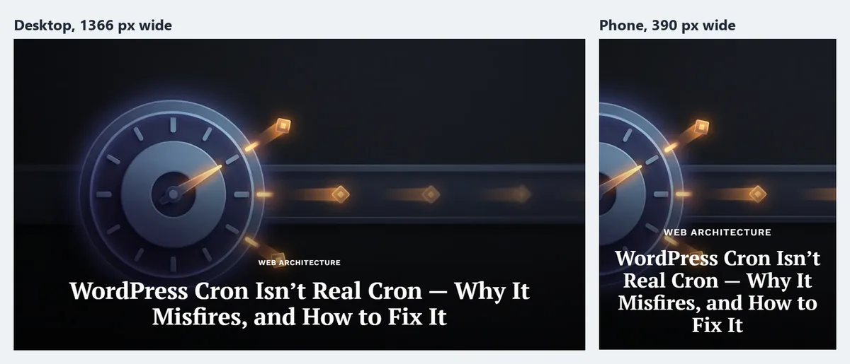
(This article’s own hero, a monitor and a phone, loses the phone on small screens in the same way.) The page weight is fine, so this is purely a composition problem, and the fix is the one described above: a crop chosen for small screens instead of whatever the center happens to be. Our plan, in order: a per-post focal point first (cheap, same file), then a purpose-made portrait crop swapped in for phones, and eventually a real <img> with <picture> so the hero gets alt text and early loading. We’ll report back here when it ships.
The short version
Standard WordPress responsive images do resolution switching — one crop, resized per device via srcset. Art direction serves a different crop per device using the HTML5 <picture> element with media conditions: a wide landscape on desktop, a tight vertical crop on a phone. That means smaller mobile payloads, a faster LCP, no layout shift (set width/height or aspect-ratio), and a hero that fills the mobile screen instead of shrinking to a strip. In WordPress, object-fit/focal points re-frame the same file (composition only), page-builder per-device backgrounds swap the file (but lose alt/indexing), and a hard-coded <picture> gives full control of crop, bytes, and SEO.
Frequently Asked Questions
What is the difference between art direction and responsive images?
Responsive images (resolution switching) serve the same crop at different pixel sizes — WordPress’s default srcset behavior. Art direction serves a different image file — a different crop or aspect ratio, sometimes a different subject — chosen by device. Responsive images fix file size; art direction fixes the composition too.
Do I need the <picture> element for art direction?
Yes, for true art direction. The <picture> element with media-gated <source> tags is the only markup that lets you command which image loads at each breakpoint. srcset on a plain <img> only offers the browser size options within a single crop.
Does art direction actually improve Core Web Vitals?
It can, meaningfully. A purpose-cropped mobile hero is a smaller file that compresses harder, so it improves Largest Contentful Paint. Pairing it with explicit width/height or CSS aspect-ratio also prevents the layout shift (CLS) that happens when an image’s box isn’t reserved in advance.
Can I do art direction in WordPress without code?
Partly. Gutenberg’s Cover block (focal point) and page-builder per-device background images give you “soft” art direction with no code — but focal points don’t cut the payload, and background images aren’t indexed by Google Images. For full control of crop, bytes, and alt text, a hard-coded <picture> element in your theme is the reliable route.
Will a hidden mobile image hurt performance?
Usually, yes. Duplicating a section and hiding one copy with display:none still lets most browsers download the hidden <img>, doubling the payload and bloating the DOM. Use <picture> (or a CSS background swap for purely decorative images) so only the needed file is fetched.

