For concepts and hard science, a hand-drawn vector beats a diffusion model on cost, consistency, and safety. Here is the exact method.
Table of Contents
When SVG is the right hero engine
SVG is code that draws a picture. Instead of steering a diffusion model with a prompt, you place every shape, gradient, and glow on purpose. That yields four properties that matter at volume: no quota, exact repeatability, structural safety (no garbled text or extra hands, because you never draw them), and free consistency across a set. The trade is realism — a hand-drawn vector cannot photograph a wok. So the rule is simple: route concepts and hard-science subjects to SVG, and photographic subjects to a diffusion model. This guide covers the first half.
A vector you author by hand can never contain a rogue letter, because no one typed one.
The model: fixed chrome, bespoke metaphor, context palette
Hold three clauses in mind and the whole method follows. The chrome is a shared treatment every image reuses, so the set coheres. The metaphor is the one bespoke idea for this subject. The palette varies with context, so the set is never one flat stamp. Chrome is constant, metaphor is bespoke, palette follows the subject.
Before you start: canvas and layer order
Author at the exact size your page card uses so nothing is discarded downstream; 1200 x 675 (the standard Open Graph card) is a safe default. Give the root an aria-label that describes the scene, and keep every coordinate inside the box.
<svg viewBox="0 0 1200 675" xmlns="http://www.w3.org/2000/svg"
     role="img" aria-label="…one sentence describing the picture…">Code language: HTML, XML (xml)
The layer stack, back to front, is always the same:
background → corner washes → particle field → [metaphor] → vignette → grainCode language: CSS (css)Step 1 — Write the chrome once, then reuse it
A single radial gradient gives depth far better than a flat fill. Keep it deep and saturated, not muddy black:
<radialGradient id="bg" cx="50%" cy="44%" r="88%">
  <stop offset="0%" stop-color="#1e3060"/>
  <stop offset="52%" stop-color="#122140"/>
  <stop offset="100%" stop-color="#0a1426"/>
</radialGradient>
<rect width="1200" height="675" fill="url(#bg)"/>
Code language: HTML, XML (xml)
A centered subject on a plain field leaves the corners dead. Fill them once with large blurred color blobs that reach every edge, plus a scatter of small dots across the whole frame for depth. Finish with a gentle vignette and a faint film grain — a feTurbulence noise pushed into a very low alpha:
<filter id="grain">
  <feTurbulence type="fractalNoise" baseFrequency="0.9" numOctaves="2"
                stitchTiles="stitch" result="n"/>
  <feColorMatrix in="n" type="matrix"
     values="0 0 0 0 0  0 0 0 0 0  0 0 0 0 0  0 0 0 0.03 0"/>
</filter>
<rect width="1200" height="675" filter="url(#grain)" opacity="0.4"/>
Code language: HTML, XML (xml)
Keep grain quiet — texture you feel but do not notice. That is the entire chrome; it never changes between heroes.
Step 2 — Choose a metaphor that shows the subject
This is where concept images usually fail: they default to a laptop or a graduation cap. Do not. Show the subject itself. Securing an application becomes a core inside layered shields with one clean channel and probes deflecting away. A database transaction becomes records advancing to a gate, one faltering, an arc sweeping the set back to the start. Keep forms abstract — suggest a database, do not render a legible schema — and keep to one idea, centered.
Show the subject, not a stock stand-in — a cooking course is a technique, not a graduation cap.
Step 3 — Pick the palette from context
The chrome is fixed; the colors are not. Deriving the palette from the subject is what keeps a large set from looking like one blue stamp. Store the palette as a few tokens at the top of the file and reference them everywhere, so a re-skin is a five-line edit.
| Subject context | Base | Accents |
|---|---|---|
| Security / cyber | deep blue | cyan + one amber |
| Data / AI | deep violet | magenta + cyan |
| Thermodynamics / heat | ember maroon | orange + gold |
| Biology / chemistry | deep teal-green | teal + violet |
| Cosmology | indigo | violet + white |
| Finance / growth | deep green | green + gold |
Step 4 — Build and light the focal forms
Concept heroes read best as flat-3D: clean isometric solids with a hint of dimension. An isometric core cube is three quadrilaterals computed from a center point:
<!-- center (600,300): top face + two sides -->
<polygon points="600,266 666,300 600,334 534,300" fill="url(#faceTop)"/>
<polygon points="534,300 600,334 600,402 534,368" fill="url(#faceLeft)"/>
<polygon points="666,300 600,334 600,402 666,368" fill="url(#faceRight)"/>
Code language: HTML, XML (xml)
Give the faces a light-to-dark gradient set and the eye reads a solid. Depth in a dark scene comes from light: two blur filters cover almost everything — a tight glow for edges and a broad bloom behind bright objects. Always place the blurred bloom behind the crisp shape, never on it.
<filter id="big" x="-90%" y="-90%" width="280%" height="280%">
  <feGaussianBlur stdDeviation="20"/></filter>
<circle cx="600" cy="320" r="130" fill="url(#coreGlow)" filter="url(#big)"/>
<!-- the crisp core shape sits on top -->
Code language: HTML, XML (xml)
Verify before you ship
Two checks catch most weak results. First, squint at the corners: if they are dead, add washes or particles until the canvas is full. Second, find the brightest mass: if it sits off toward a corner, move it to the center axis and balance the supporting shapes left and right. A hero should feel planted, not sliding out of frame.
Here is the method applied to a security course, then re-skinned to two other subjects by changing only the palette tokens and the metaphor:


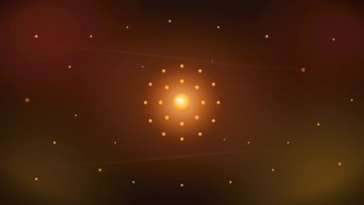
Three subjects, three palettes, one unmistakable family — none of which cost anything to make.
One drawing, many looks: recolor and reuse
Because the palette lives in a few color tokens at the top of the file, changing those codes restyles the whole image without touching a single shape. The same drawing becomes a warm variant, a cool one, or a category-themed one in seconds — the composition stays, only the mood changes.
That also makes one file reusable in many places. A single SVG can render in a different palette per context: a section color on one page, a dark-mode variant on another, a seasonal or campaign theme on a third — all from the same source, each output distinct. A fixed raster cannot do this; you would generate a new image for every color. With SVG, one drawing quietly serves a whole family of looks.
Change a few color codes and the same drawing wears a new look — one SVG can serve many places, each in its own palette.
Troubleshooting common SVG mistakes
- The whole background renders black. You referenced gradients or filters with
url(#id)but left out the<defs>block that declares them, so every reference resolves to nothing – the background, washes, and glows all vanish. The trap: shapes with plain solid fills still show, so the image looks half-drawn rather than broken, which hides the cause. Include the defs, and always render the file to check it, not just parse it: the markup is well-formed and the colors are valid either way, so only an actual render (a headless browser works) exposes a missing reference. - Blooms get clipped. A blur with the default region crops; widen it, e.g.
x="-60%" y="-60%" width="220%" height="220%". - A shape looks out of focus. You blurred the shape itself; blur a copy behind it and keep the original crisp.
- Faux text creeps in. Dense repeated marks can read like letters. Simplify until nothing resembles a glyph.
- The grain is too loud. Lower the alpha and the layer opacity; grain should read as surface, not noise.
Rasterize for social cards
Social and link-preview scrapers cannot read SVG, so the featured image needs a raster copy. Render the SVG to PNG or WebP once at export time with any headless renderer — no model, no quota. The SVG stays the master; the raster is a derivative. For embedding the SVG on the page itself, and for shrinking it, the companion guide on SVG for web design covers the delivery side — <img> versus inline, optimization, and the viewBox traps that make a sharp format look blurry.
When not to use SVG
If the subject is a real, textured thing — a dish, an instrument, a landscape — stop and use a diffusion model. Hand-drawn vector will look like a diagram of the thing, not the thing. Know the boundary and the two engines together cover the whole catalog: vector for ideas, diffusion for scenes.
The short version
Generate SVG hero images as two layers: a fixed chrome you reuse for coherence, and one bespoke, centered metaphor per subject, colored from the subject’s context. Keep forms abstract so no text or hand can appear, verify that the canvas is full and the weight is centered, and rasterize once for social cards. The output is free, exact, endlessly consistent, and safe by construction — for every concept and hard-science subject in the catalog.
Frequently Asked Questions
Why generate hero images as SVG instead of using an AI image model?
For concepts and hard science, SVG is free, exact, endlessly consistent, and cannot produce garbled text or extra hands. A diffusion model is metered, drifts across a set, and occasionally breaks rules. Reserve the model for photographic subjects a vector cannot draw.
How do I keep a set of SVG images looking consistent?
Reuse the same chrome — the background gradient, corner washes, particle field, and grain — in every image, and vary only the metaphor and the palette. Shared source code guarantees the set reads as one family.
Should every SVG image use the same colors?
No. Fix the treatment, not the color. Derive each palette from the subject — cool for security, violet for data, warm for heat — so the set is coherent without being monotonous.
How do I keep text and hands out of an SVG hero?
Do not draw them. Suggest form, light, and color instead of spelling anything, and keep every shape abstract. Because you author each element, an unwanted letter or hand can only appear if you place it.
Do SVG heroes work as social share images?
Yes, once rasterized. Link-preview scrapers cannot read SVG, so render a PNG or WebP copy at export time and keep the SVG as the master. The conversion runs locally with no model and no quota.

